Background
Background
I led the redesign of Pound & Grain’s website and digital presence as part of my role at the design agency. Our objective was to execute a comprehensive refresh of the UX and UI, updating key elements to reflect the evolving Pound & Grain brand. This project aimed to enhance user experience, modernize the visual identity, and improve overall site performance.
I led the redesign of Pound & Grain’s website and digital presence as part of my role at the design agency. Our objective was to execute a comprehensive refresh of the UX and UI, updating key elements to reflect the evolving Pound & Grain brand. This project aimed to enhance user experience, modernize the visual identity, and improve overall site performance.
Research & Analysis
Research & Analysis
We initiated the project with an in-depth analysis of the existing site and competitive benchmarking. I conducted interviews with the four partners and stakeholders to understand the website's needs and pain points. I also reviewed local and global industry competitors' websites to identify best practices and areas for differentiation. In addition, we identified opportunities to showcase our personality in unique ways to surprise and delight users.
We initiated the project with an in-depth analysis of the existing site and competitive benchmarking. I conducted interviews with the four partners and stakeholders to understand the website's needs and pain points. I also reviewed local and global industry competitors' websites to identify best practices and areas for differentiation. In addition, we identified opportunities to showcase our personality in unique ways to surprise and delight users.
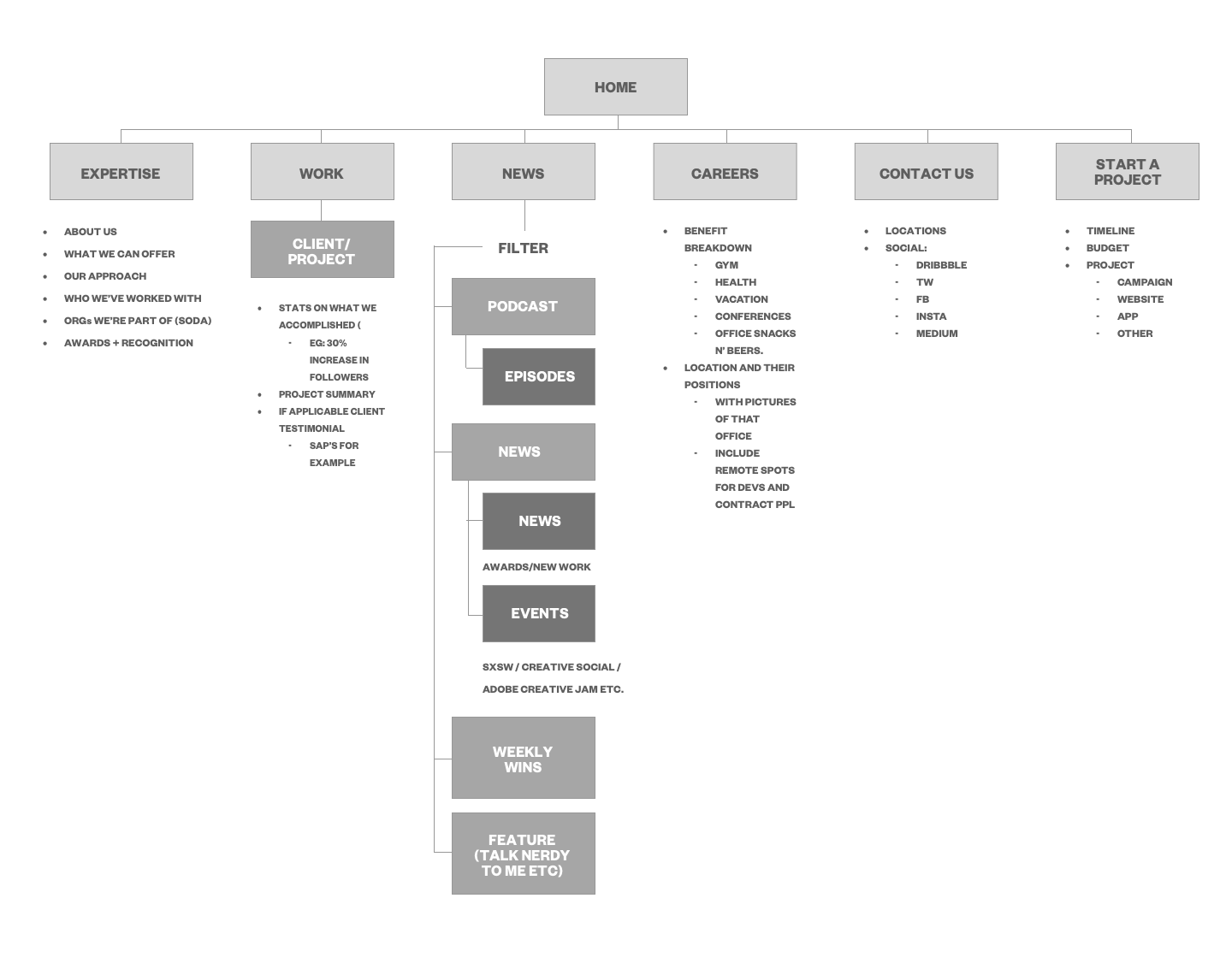
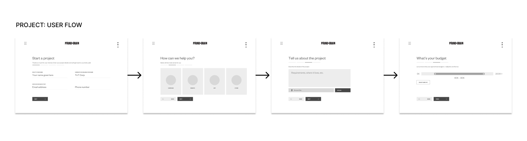
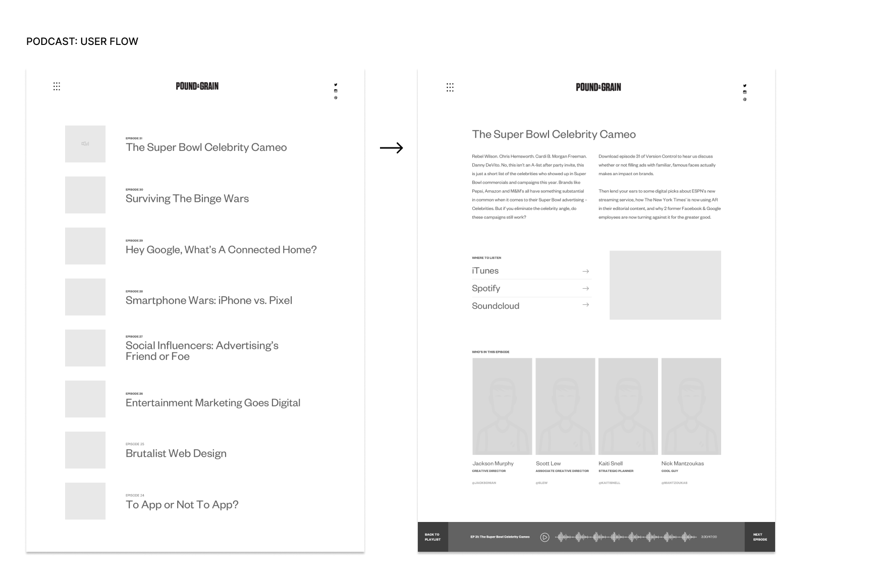
Userflow & Prototyping
Userflow and Prototyping
Based on our research findings, I developed several wireframes aimed at improving the site's usability. The key proposals included enhancing navigation by streamlining the site's structure to facilitate easier access to key information and services, creating a modern and visually appealing design that aligns with Pound & Grain's updated brand identity, and incorporating interactive elements to engage users and enhance their browsing experience.
Based on our research findings, I developed several wireframes aimed at improving the site's usability. The key proposals included enhancing navigation by streamlining the site's structure to facilitate easier access to key information and services, creating a modern and visually appealing design that aligns with Pound & Grain's updated brand identity, and incorporating interactive elements to engage users and enhance their browsing experience.
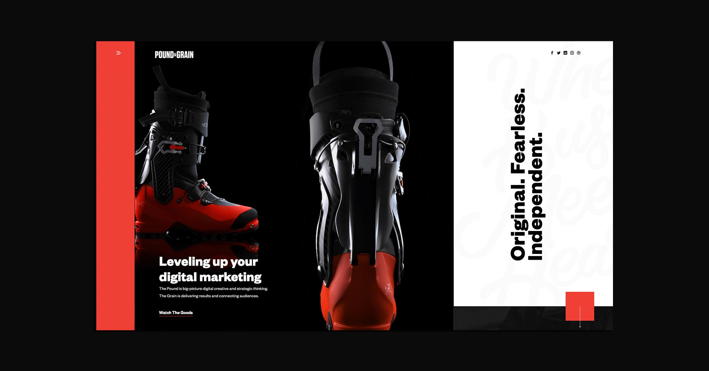
Finalized Design & UI Package
Finalized Design & UI Package
With feedback in mind, I finalized the design to ensure a cohesive and polished look and feel. Key deliverables included detailed high-fidelity prototypes showcasing the final design and interactions, as well as a comprehensive UI package for the development team. This package included design specifications, style guides, and interaction patterns.
With feedback in mind, I finalized the design to ensure a cohesive and polished look and feel. Key deliverables included detailed high-fidelity prototypes showcasing the final design and interactions, as well as a comprehensive UI package for the development team. This package included design specifications, style guides, and interaction patterns.
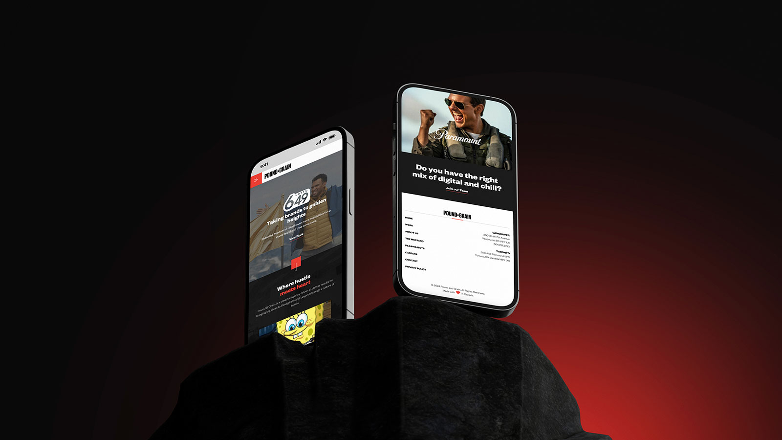
Moments of Delight
Moments of Delight
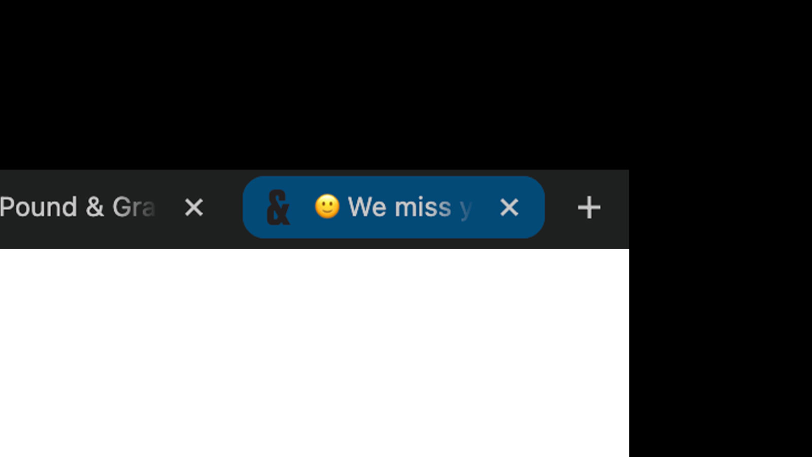
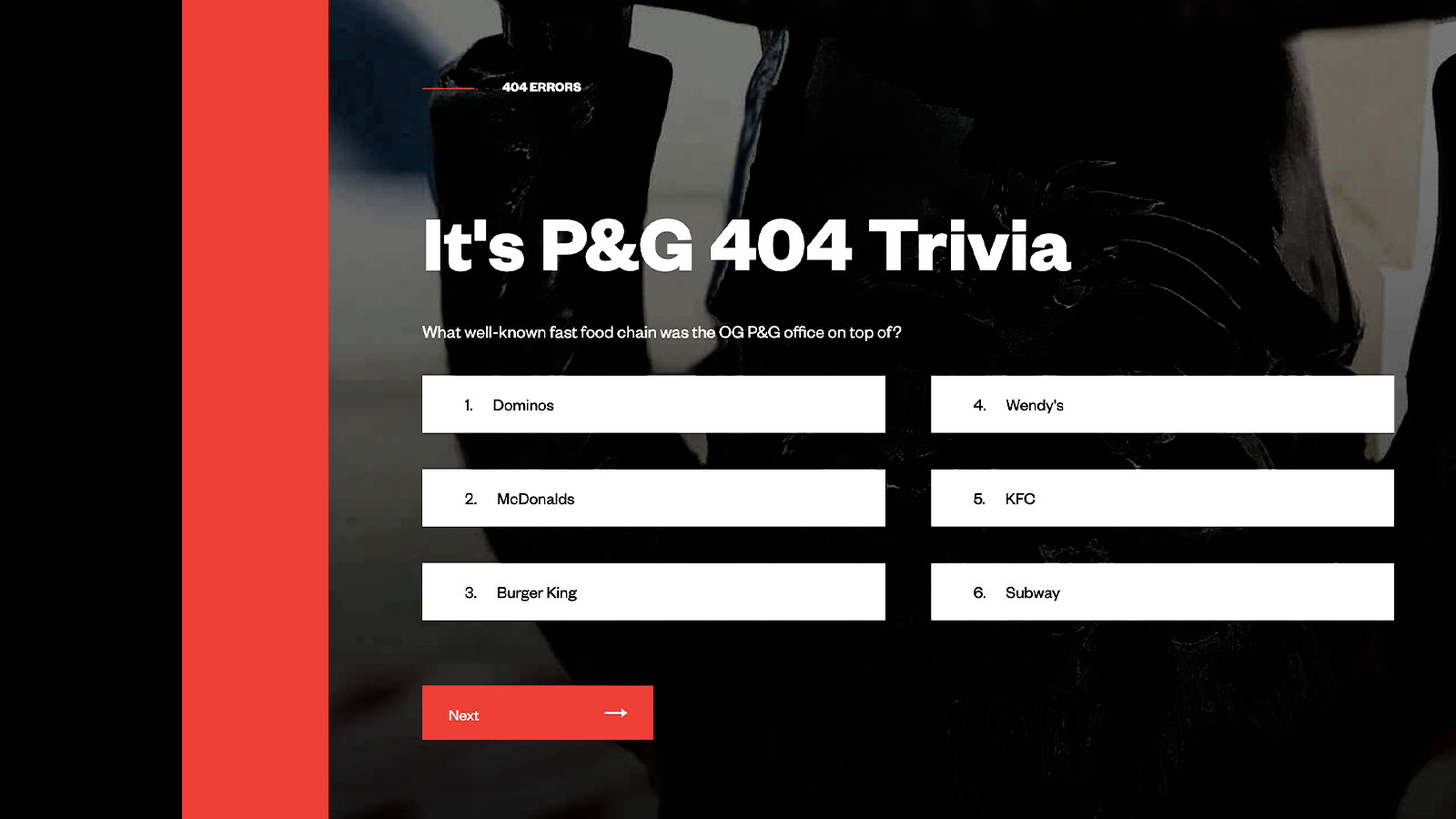
As part of the redesign, we incorporated "Easter eggs"—hidden features and playful elements designed to surprise and delight users. These Easter eggs added a layer of personality and charm to the website, reflecting Pound & Grain’s creative spirit and engaging users in a memorable way.
By embedding these delightful surprises, we aimed to create a deeper emotional connection with users, encouraging them to explore the site more thoroughly and enjoy their experience. We created a unique tab when users left, letting them know we missed them and utilizedg our 404 page to entice users to play trivia to learn more about the agency.
Launch & Results
Launch & Results
The redesigned website launched successfully. The updated design effectively communicated Pound & Grain’s brand values and identity, contributing to a stronger digital presence.
Overall, this project underscored my ability to lead and execute a comprehensive UX and UI redesign. The successful transformation of the Pound & Grain website not only elevated the brand but also demonstrated the impact of user-centered design in achieving strategic business goals.
Role: Art Director
Contribution: UX/UI
Agency: Pound & Grain
Client: Pound & Grain
Scope: Website redesign
Role: Art Director
Contribution: UX/UI
Agency: Pound & Grain
Year: 2018
Client: Pound & Grain
Scope: Website redesign
Creative Director
Based in Vancouver